← Back
UX case studies that changed
the world and inspire design decisions.
UX lessons
- Therac-25
- The Post Office Horizon Scandal (UK)
- Boeing 737 MAX (2018)
- Three Mile Island Nuclear Disaster (1979)
- Volkswagen Emissions Scandal (2015)
- McDonald’s Touchscreens & Hidden Fees (2018)
Therac-25
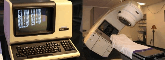
Therac-25 was a radiation therapy machine used in hospitals in the 1980s.
A UI design flaw allowed technicians to accidentally administer massive overdoses of radiation,
killing at least six patients and seriously injuring others.

Source image: Wikipedia. Software compiled from source code available at [1], Copyrighted free use, Link
The UX/UI mistake:
- The interface was confusing & misleading. Operators could enter treatment settings too quickly
(before the machine registered changes) and the system would default to a high-radiation mode without warning.
- No error messages were properly displayed. When an error occurred, the system still looked like it was working correctly.
Technicians thought everything was fine, but patients were getting fatal doses of radiation.
- Prototyping in HTML, using GitHub for version control and seamless collaboration
with developers.
- No failsafe mechanisms. The system relied too much on software controls, removing the physical safety interlocks that previous models had.
Lesson Learned:
- Never assume users will interact perfectly with a system.
- Clear feedback & fail-safes are essential in UX - especially in critical systems.
- Don’t remove safety features in favor of "efficiency".
- UX isn’t just about making things look nice. It can literally be a matter of life and death.
The Post Office Horizon Scandal (UK) - UX Destroyed Lives.
The UK Post Office Horizon IT system (by Fujitsu) falsely accused hundreds of postmasters of financial fraud due to bad
software & UX flaws (1999-2015). The system had glitches that created accounting errors, making it look like money was missing. Postmasters were wrongly prosecuted, leading to prison sentences, suicides, bankruptcies, and ruined reputations.

Source images: By Muhammad Karns - Judicial Office Twitter feed., CC BY-SA 4.0, Link
The UX/UI mistake:
- No error handling. The system showed incorrect financial losses but had no way for users to verify or correct them.
- Lack of transparency. Postmasters weren’t told about known system errors.
- Complex, unusable UI. Staff couldn't track down errors due to confusing workflows and hidden data.
Lesson Learned:
- Accountability in UX is critical.
- A bad UI can literally ruin innocent people’s lives.
Boeing 737 MAX (2018) - A UX Disaster That Killed 346 People
Boeing introduced a new flight control system (MCAS) to the 737 MAX aircraft but failed to inform pilots about how it worked.
A single sensor failure could trigger the system, pushing the plane’s nose down uncontrollably. Due to a lack of proper alerts and UI feedback, pilots couldn’t override it—resulting in two fatal crashes (Lion Air & Ethiopian Airlines), killing 346 people.

Source images: By PK-REN - https://www.flickr.com/photos/pkaren/45953419622/,
CC BY-SA 2.0, Link
The UX/UI mistake:
- Lack of visibility. Pilots didn’t know about MCAS or how to disable it.
- No clear warnings. The system didn’t properly alert pilots when it activated.
- Hidden design flaws. Boeing tried to minimize costs by not requiring extra pilot training, assuming pilots would “just figure it out”.
Lesson Learned:
- User training and transparency are essential in UX, especially in high-risk systems.
Three Mile Island Nuclear Disaster (1979) – Confusing UI Led to a Meltdown
A partial meltdown occurred at the Three Mile Island nuclear power plant (USA) due to a combination of UX design flaws and operator confusion.
The warning system was a mess—instead of clear, actionable alerts, it overloaded operators with hundreds of vague alarms.
Operators misinterpreted faulty indicators, shutting down the wrong systems and making the situation worse.

Source images: By United States Department of Energy - http://ma.mbe.doe.gov/me70/history/photos.htm
Copyright status: Identified on DOE page as "DOE photo", i.e. not copyrighted., Public
Domain, Link
The UX/UI mistake:
- Overwhelming alerts. The interface bombarded operators with too much data at once, making it impossible to tell what was critical.
- Misleading indicators. The UI showed that a valve was closed when it was actually open, leading to coolant loss.
- No hierarchy of importance. Everything looked equally urgent, so operators couldn’t focus on what actually mattered.
Lesson Learned:
- Clear, actionable UI saves lives—especially in high-stress environments.
Volkswagen Emissions Scandal (2015) – UX Was Used to Deceive.
Volkswagen designed their diesel cars to cheat emissions tests by using software that detected when the car was being tested and
adjusted emissions accordingly. This made it seem like the cars were environmentally friendly when, in reality, they were pumping out illegal pollution levels.

Source images: By Mariordo Mario Roberto Duran Ortiz - Own work, CC BY-SA 3.0, Link
The UX/UI mistake:
- Deceptive UI. The dashboard showed fake data, making both regulators and users believe the cars were "clean".
- Hidden behavior. There was no way for users to detect that the car was running in "cheat mode".
Lesson Learned:
- Ethical UX matters. Bad UX can be intentionally used to deceive.
McDonald’s Touchscreens & Hidden Fees (2018).
McDonald’s introduced self-order kiosks, which were designed to increase upsells. But they purposely made it hard to remove
extra charges (e.g., "extra cheese" was selected by default). In some cases, it even added fees without users noticing.

Source images: By Dirk Tussing from Chicago IL,
United States - New-McDonald-HU-lg,
CC BY-SA 2.0, Link
The UX/UI mistake:
- Dark patterns. The UI tricked users into spending more money by making removal options hard to find.
- Lack of transparency. The total cost wasn’t always clearly updated.
Lesson Learned:
- Ethical UX should never manipulate users into spending more than they intended.
← Back to case studies


